<!DOCTYPE html>
<html lang="en">
<head>
<meta charset="UTF-8">
<meta name="viewport" content="width=device-width, initial-scale=1.0">
<title>transition+transform+animation</title>
</head>
<style>
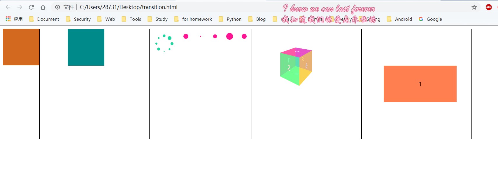
.transitionTest,
.loading,
.box1,
.loadingRow,
.animate3D,
.replace {
float: left;
}
.transitionTest {
width: 100px;
height: 100px;
background-color: chocolate;
/*
transition-property,transition-duration,transition-timing-function 和 transition-delay
linear 规定以相同速度开始至结束的过渡效果(等于 cubic-bezier(0,0,1,1)) (匀速)
ease 规定慢速开始,然后变快,然后慢速结束的过渡效果(cubic-bezier(0.25,0.1,0.25,1))(相对于匀速,中间快,两头慢)
ease-in 规定以慢速开始的过渡效果(等于 cubic-bezier(0.42,0,1,1))(相对于匀速,开始的时候慢,之后快)
ease-out 规定以慢速结束的过渡效果(等于 cubic-bezier(0,0,0.58,1))(相对于匀速,开始时快,结束时候间慢,)
ease-in-out 规定以慢速开始和结束的过渡效果(等于 cubic-bezier(0.42,0,0.58,1))(相对于匀速,(开始和结束都慢)两头慢)
cubic-bezier(n,n,n,n) 在 cubic-bezier 函数中定义自己的值。可能的值是 0 至 1 之间的数值
*/
transition: all .5s ease-in-out .5s;
}
.transitionTest:hover {
width: 150px;
height: 150px;
background-color: blueviolet;
}
.box1,
.box,
.replace {
width: 300px;
height: 300px;
border: 1px solid;
}
.box2 {
width: 100px;
height: 100px;
background-color: darkcyan;
transform-origin: center;
animation: my 3s ease-in-out 0s infinite normal none running;
/*
animation---动画
animation-name,animation-duration, animation-timing-function,animation-delay,
animation-iteration-count,animation-direction,animation-fill-mode 和 animation-play-state
name, duration, timing-function, delay 同上
delay 正值-->延迟过渡指定时间,负值-->从提前动画指定时间处开始
animation-iteration-count 动画执行次数(default:1),[number(也可小数)/infinite]
animation-direction 指示动画是否反向播放
normal(default)
每个循环内动画向前循环,换言之,每个动画循环结束,动画重置到起点重新开始
alternate
动画交替反向运行,反向运行时,动画按步后退,同时,带时间功能的函数也反向,比如,ease-in 在反向时成为ease-out。计数取决于开始时是奇数迭代还是偶数迭代
reverse
反向运行动画,每周期结束动画由尾到头运行
alternate-reverse
反向交替, 反向开始交替
动画第一次运行时是反向的,然后下一次是正向,后面依次循环。决定奇数次或偶数次的计数从 1 开始
animation-fill-mode 设置CSS动画在执行之前和之后如何将样式应用于其目标,当有设置 delay 时才有效果
none: 动画结束后回到初始位置,0%在延迟后生效
backwards: 0%在延迟前生效
forwards: 动画结束后停到结束位置
both: backwards+forwards
animation-play-state 定义一个动画是否运行或者暂停(default:running),[running/paused];通常用于 JS
*/
}
.box2:hover {
/*
均有各自的 X/Y/Z/3d
translate 为百分数时是相对于自身的大小
scale 放大/缩小
rotate 旋转(单位:deg) ---正值->顺时针 --- 负值->逆时针
rotate3d(0,0,1,30deg) --- 绕 z 轴旋转 30 度
skew 斜切(单位:deg)(只有X/Y) ---正值->左 --- 负值->右
matrix 指定的 6(a,b,c,d,e,f) 个值组成的 2D 变换矩阵
X = ax + cy + e
Y = bx + dy + f
复合写在一起时:执行顺序为自右至左
变形时不会影响其他元素且只能添加到块级元素
*/
}
@keyframes my {
0% {
transform: translate(0, 0);
}
25% {
transform: translate(200px, 0);
}
50% {
transform: translate(200px, 200px);
}
75% {
transform: translate(0, 200px);
}
100% {
transform: translate(0, 0);
}
}
.loading {
width: 40px;
height: 40px;
margin: 20px;
position: relative;
}
.loading1,
.loading2 {
width: 100%;
height: 100%;
position: absolute;
}
.loading2 {
transform: rotate(45deg);
}
.loading1 div,
.loading2 div {
width: 10px;
height: 10px;
border-radius: 50%;
background-color: rgb(28, 214, 158);
position: absolute;
animation: scaleAll 1.5s linear infinite;
}
@keyframes scaleAll {
0% {
transform: scale(0);
}
50% {
transform: scale(1);
}
100% {
transform: scale(0);
}
}
.loading1 div:nth-child(1),
.loading2 div:nth-child(1) {
left: 0;
top: 0;
}
.loading1 div:nth-child(2),
.loading2 div:nth-child(2) {
right: 0;
top: 0;
}
.loading1 div:nth-child(3),
.loading2 div:nth-child(3) {
right: 0;
bottom: 0;
}
.loading1 div:nth-child(4),
.loading2 div:nth-child(4) {
left: 0;
bottom: 0;
}
.loading1 div:nth-child(1) {
animation-delay: -0;
}
.loading2 div:nth-child(1) {
animation-delay: -.2s;
}
.loading1 div:nth-child(2) {
animation-delay: -.4s;
}
.loading2 div:nth-child(2) {
animation-delay: -.6s;
}
.loading1 div:nth-child(3) {
animation-delay: -.8s;
}
.loading2 div:nth-child(3) {
animation-delay: -1s;
}
.loading1 div:nth-child(4) {
animation-delay: 1.2s;
}
.loading2 div:nth-child(4) {
animation-delay: 1.4s;
}
.loadingRow {
width: 200px;
height: 50px;
display: flex;
}
.loadingRow div {
width: 20px;
height: 20px;
background-color: deeppink;
border-radius: 50%;
margin: 10px;
flex: 1;
animation: scaleAll 2s linear infinite alternate-reverse;
}
.loadingRow div:nth-child(1) {
animation-delay: -0;
}
.loadingRow div:nth-child(2) {
animation-delay: -.8s;
}
.loadingRow div:nth-child(3) {
animation-delay: -1.2s;
}
.loadingRow div:nth-child(4) {
animation-delay: -1.6s;
}
.loadingRow div:nth-child(5) {
animation-delay: -2s;
}
.animate3D {
margin: 0;
padding: 0;
}
.box {
/*
指定了观察者与 z=0 平面的距离,使具有三维位置变换的元素产生透视效果,
z>0 的三维元素比正常大,而 z<0 时则比正常小,大小程度由该属性的值决定。
*/
perspective: 200px;
/*
指定了观察者的位置
([left/right/center/percent],[top/bottom/center/percent])
*/
perspective-origin: center top;
}
ul {
clear: both;
list-style: none;
position: relative;
transform-style: preserve-3d;
/* 基点 Z轴只能为 number
([left,center,right],[top,center,bottom],[number])
一个值时另外两个默认 center
*/
transform-origin: center center -100px;
text-align: center;
margin: 100px;
transition: 2s;
}
li {
width: 100px;
height: 100px;
position: absolute;
line-height: 100px;
text-align: center;
color: white;
font-size: 26px;
opacity: .75;
}
li:nth-child(1) {
background-color: tomato;
left: 0;
top: 0;
}
li:nth-child(2) {
background-color: rgb(71, 255, 154);
left: 100px;
top: 0;
transform: rotateY(90deg);
transform-origin: left;
}
li:nth-child(3) {
background-color: rgb(126, 71, 255);
left: -100px;
top: 0;
transform: rotateY(-90deg);
transform-origin: right;
}
li:nth-child(4) {
background-color: rgb(237, 255, 71);
left: 0;
top: 100px;
transform: rotateX(-90deg);
transform-origin: top;
}
li:nth-child(5) {
background-color: rgb(255, 71, 184);
left: 0;
top: -100px;
transform: rotateX(90deg);
transform-origin: bottom;
}
li:nth-child(6) {
background-color: rgb(255, 197, 71);
left: 0;
top: 0;
transform: translateZ(-100px) rotateY(180deg);
}
.box:hover ul {
transform: rotateY(360deg);
}
.replace {
position: relative;
display: flex;
justify-content: center;
align-items: center;
perspective: 600px;
}
.first,
.second {
width: 200px;
height: 100px;
display: flex;
justify-content: center;
align-items: center;
position: absolute;
margin: 0 10px;
transition: 1s;
backface-visibility: hidden;
}
.first {
background-color: coral;
transform: rotateY(0);
}
.second {
background-color: rgb(216, 48, 104);
transform: rotateY(180deg);
}
.replace:hover .first {
transform: rotateY(-180deg);
}
.replace:hover .second {
transform: rotateY(0);
}
/*
有关 background: https://developer.mozilla.org/zh-CN/docs/Web/CSS/background
text-shadow为文字添加阴影,每个阴影值由元素在X和Y方向的偏移量、模糊半径和颜色值组成; 添加多个阴影,阴影值之间用逗号隔开
text-shadow: 1px 1px 2px pink;
box-shadow 属性用于在元素的框架上添加阴影效果,该属性可设置的值包括X轴偏移、Y轴偏移、阴影模糊半径、阴影扩散半径,和阴影颜色,并以多个逗号分隔
box-shadow: 12px 12px 2px 1px rgba(0, 0, 255, .2);
mask 允许使用者通过部分或者完全隐藏一个元素的可见区域,多个遮罩用逗号隔开
(url x y/width height repeat ) x/y 也可以为 left/right/center
.anothertarget {
mask: url(resources.svg#c1) 50px 30px/10px 10px repeat-x exclude;
}
CSS linear-gradient() 函数用于创建一个表示两种或多种颜色线性渐变的图片。
background: linear-gradient(45deg,#e66465, #9198e5);
More: https://developer.mozilla.org/zh-CN/docs/Web/CSS/linear-gradient
box-reflect 设置倒影
<direction>[above,below,left,right] <offset> 遮罩 | 渐变(只支持透明度的渐变)
-webkit-box-reflect: below 0 -webkit-linear-gradient(transparent,transparent 50%,rgba(255,255,255,.3));
兼容性不太好,可以使用 scale(-1) 来代替
blur 对容器进行模糊操作
calc 进行四则计算 calc(100% - 100px)
伪类: :hover
伪元素(创建一个虚拟容器): ::before ::after ::selection
*/
</style>
<body>
<div class="transitionTest"></div>
<div class="box1">
<div class="box2"></div>
</div>
<div class="loading">
<div class="loading1">
<div></div>
<div></div>
<div></div>
<div></div>
</div>
<div class="loading2">
<div></div>
<div></div>
<div></div>
<div></div>
</div>
</div>
<div class="loadingRow">
<div></div>
<div></div>
<div></div>
<div></div>
<div></div>
</div>
<div class="animate3D">
<div class="box">
<ul>
<li>1</li>
<li>2</li>
<li>3</li>
<li>4</li>
<li>5</li>
<li>6</li>
</ul>
</div>
</div>
<div class="replace">
<div class="first">1</div>
<div class="second">2</div>
</div>
</body>
</html>
|